Answer the Call
The Problem
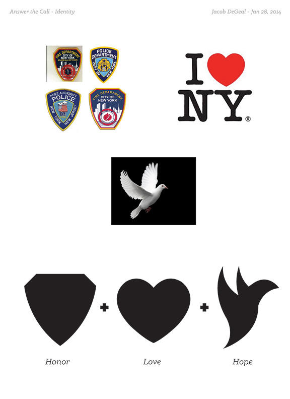
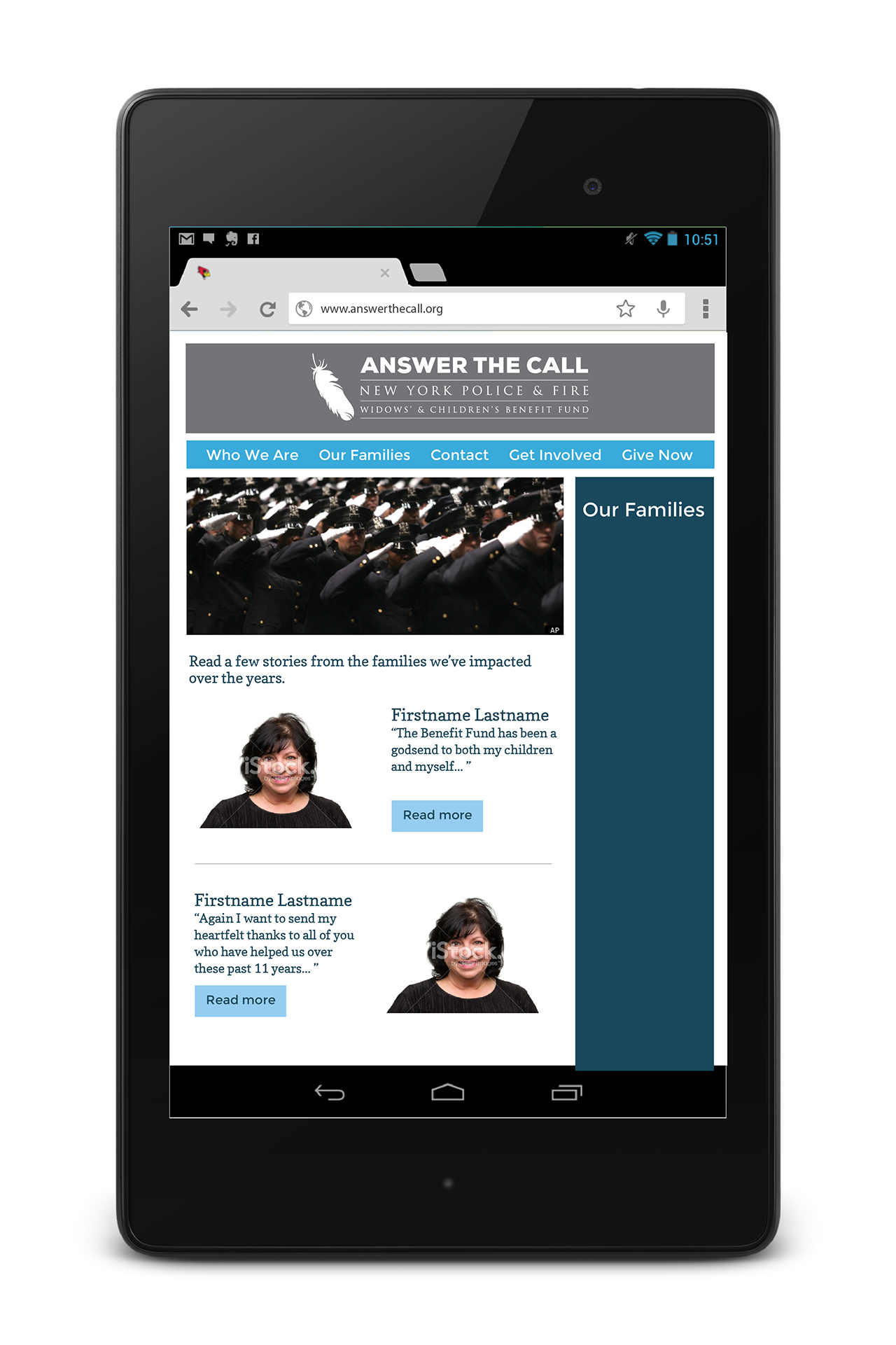
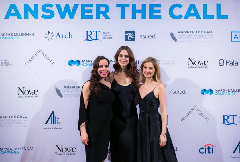
Answer the Call is a moniker for the New York Police & Fire Widow’s & Children’s Benefit Fund; a non-profit fundraising organization to financially help the families of first responders in New York and New Jersey who lost their lives in the line of duty. The website and brand was over a decade old, and was developed in the wake of the events of September 11. The brand was solemn and dark, and the website needed to catch up with contemporary fundraising expectations.
The Project
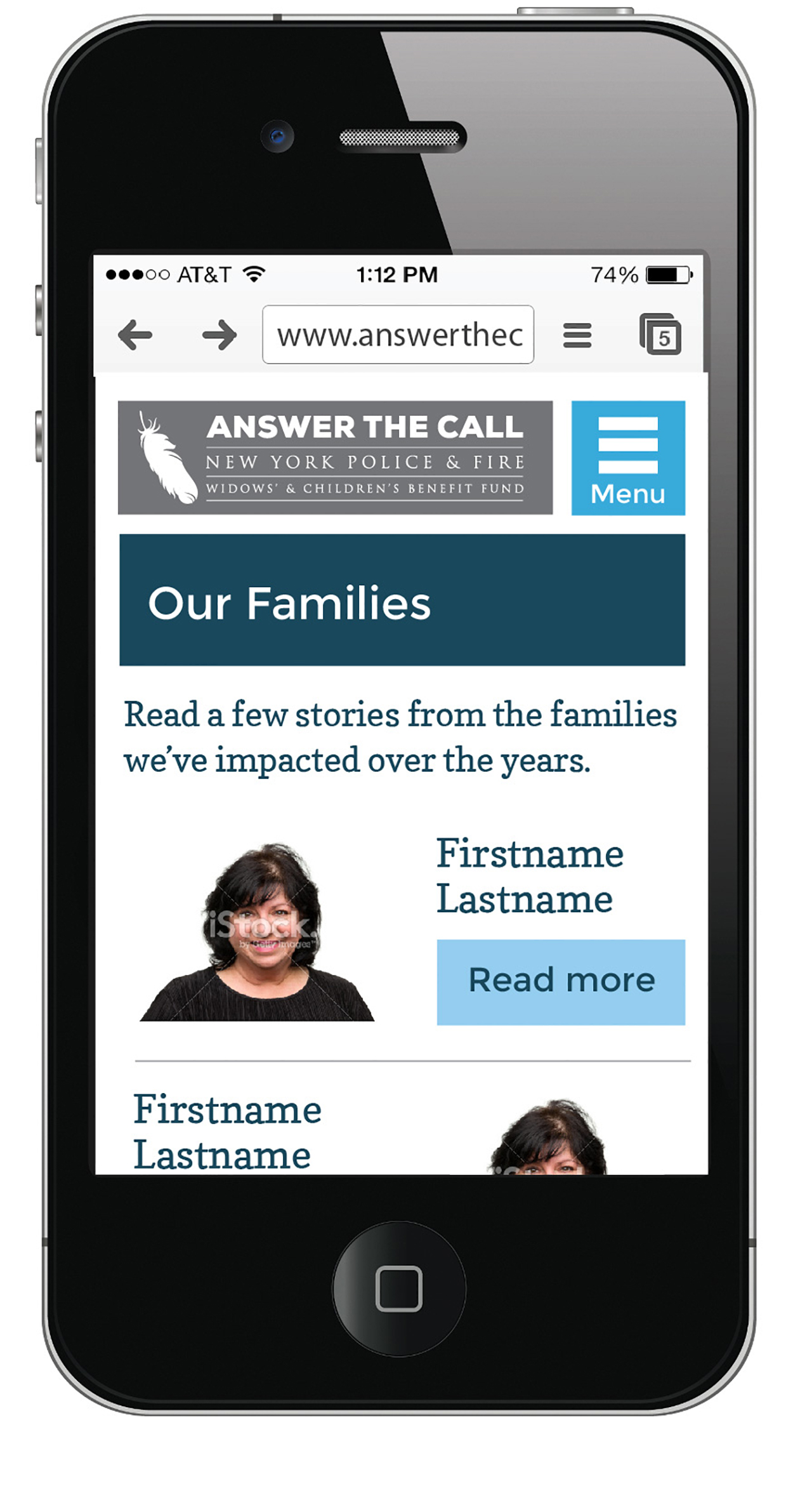
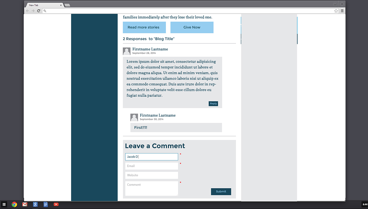
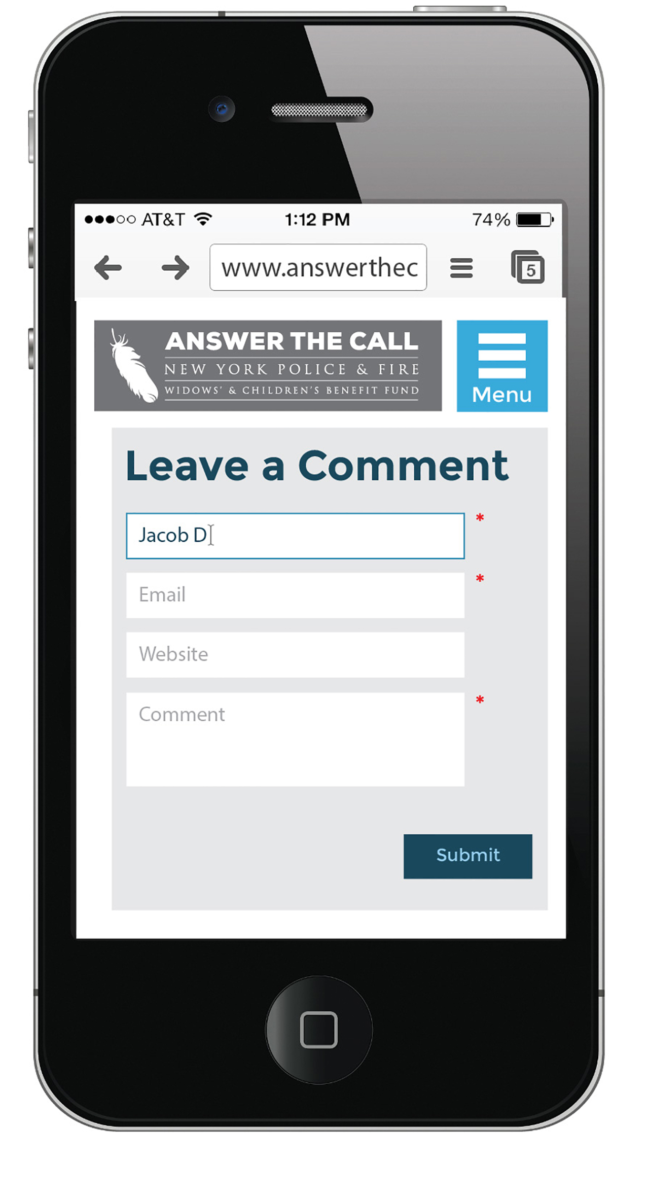
Answer the Call became the official marketing name for the organization in 2014, and the brand needed a brighter and more hopeful look and feel while not forgetting the sacrifice made by first responders. In addition, the organization’s marketing managers needed the ability to keep the website updated with events, news, and personal stories from beneficiaries, as well coordinate and process donations and sustaining gifts.
Responsibilities
- Worked closely with clients to understand ethos, goals, vision, and mood.
- Developed new identity standards to compliment and carry out brand refresh.
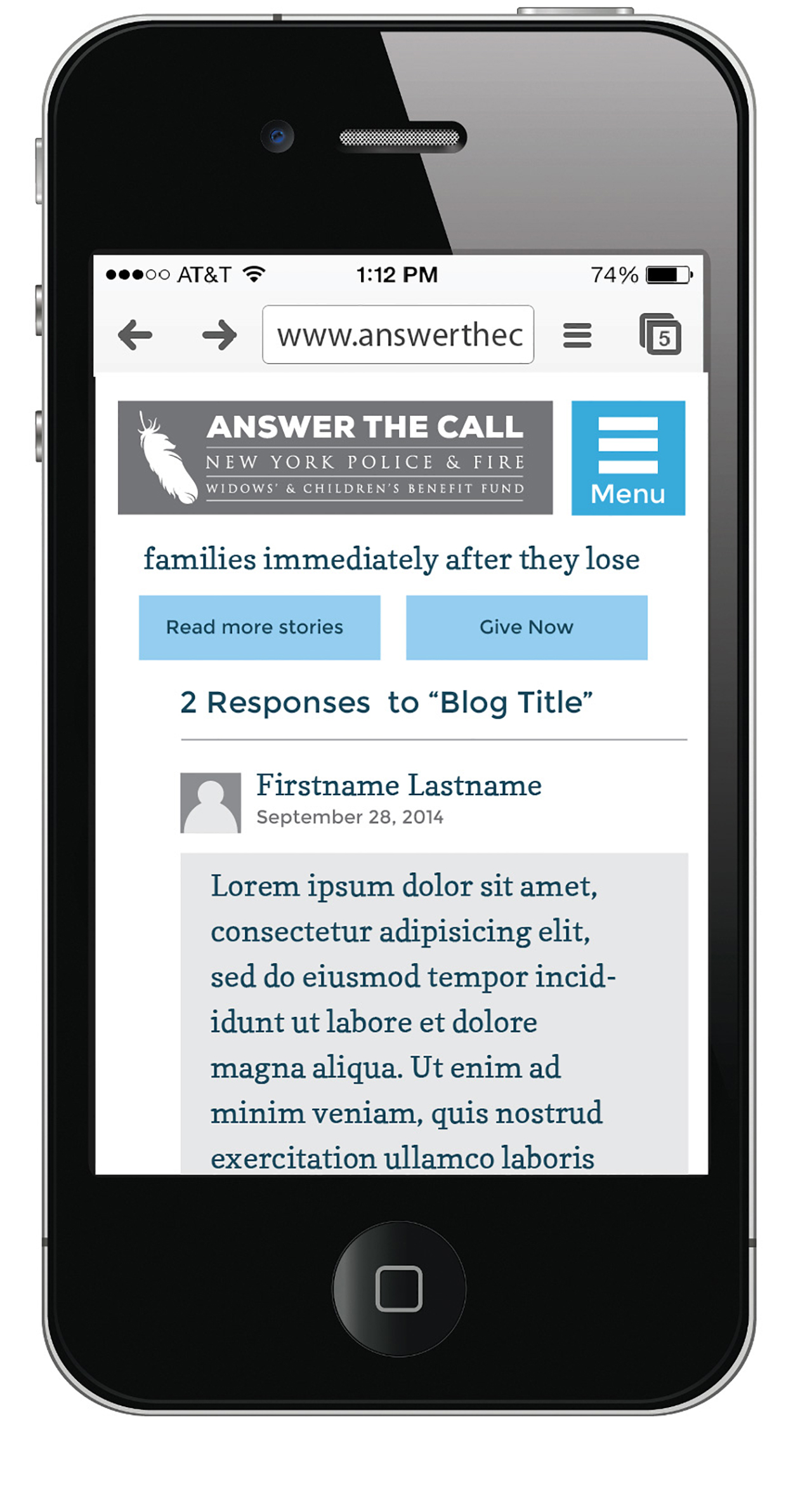
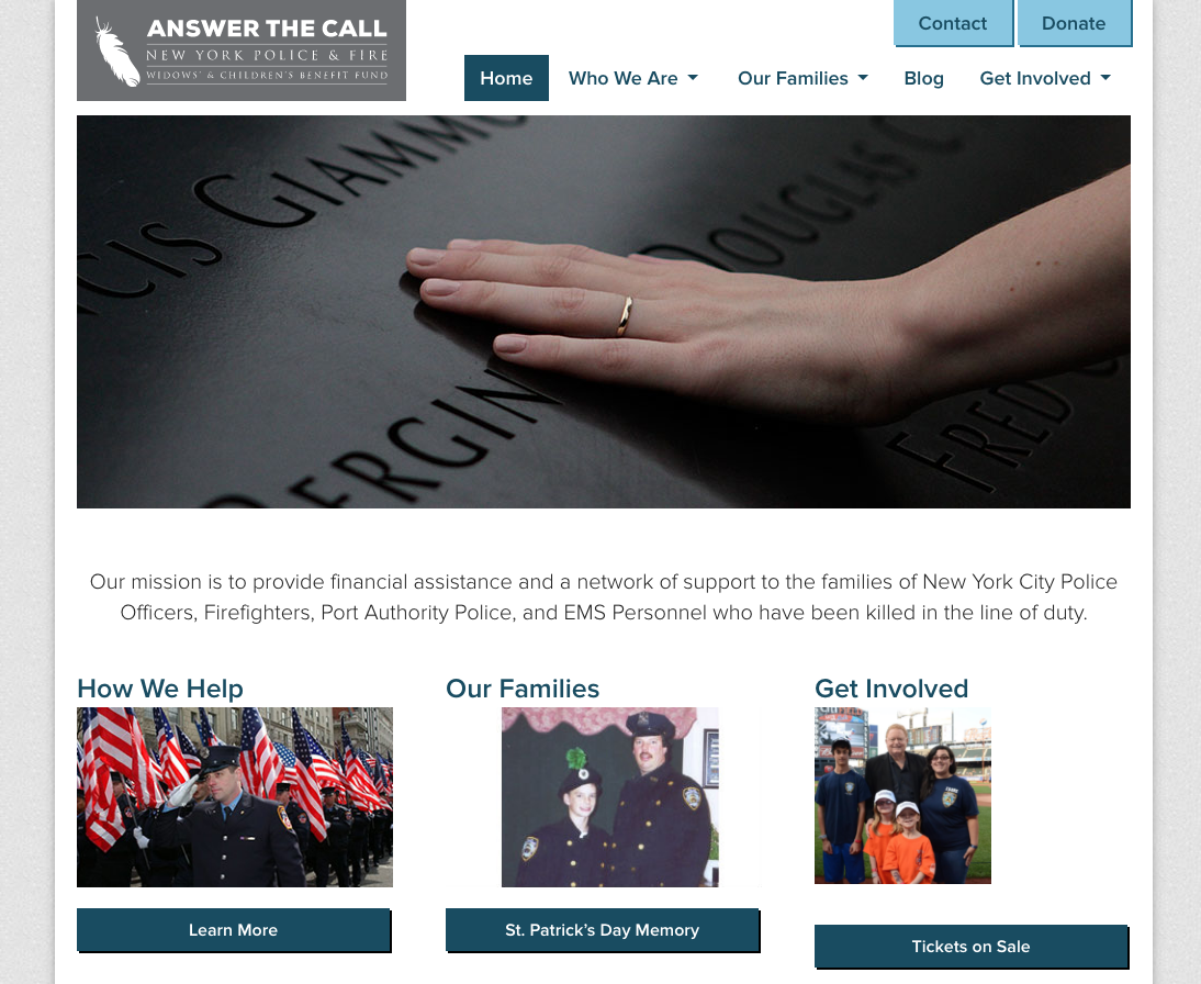
- Designed high-fidelity website mockups to improve user experience and match new brand.
- Collaborated between project managers, clients, board members, and web developers across four different cities to iterate progressive design solutions.

The Solution
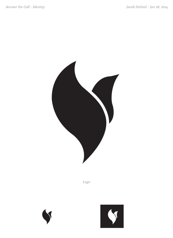
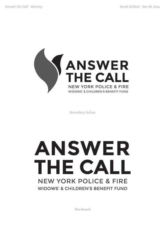
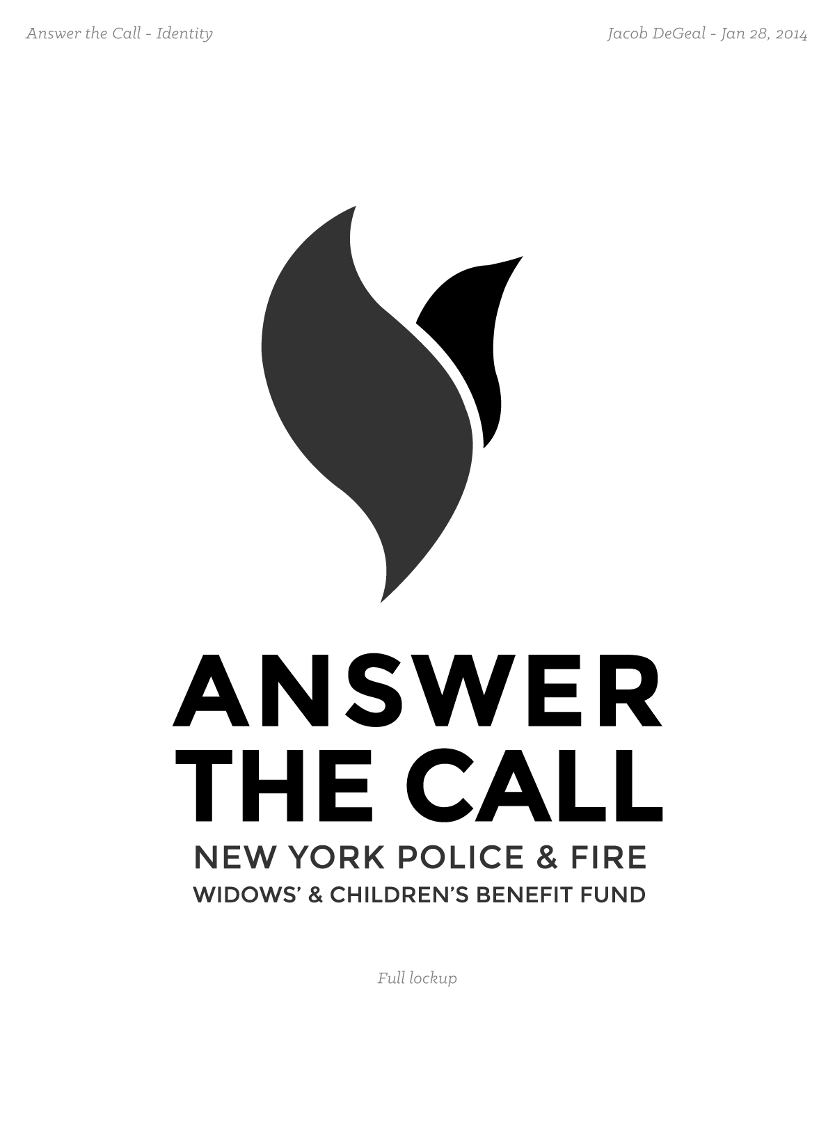
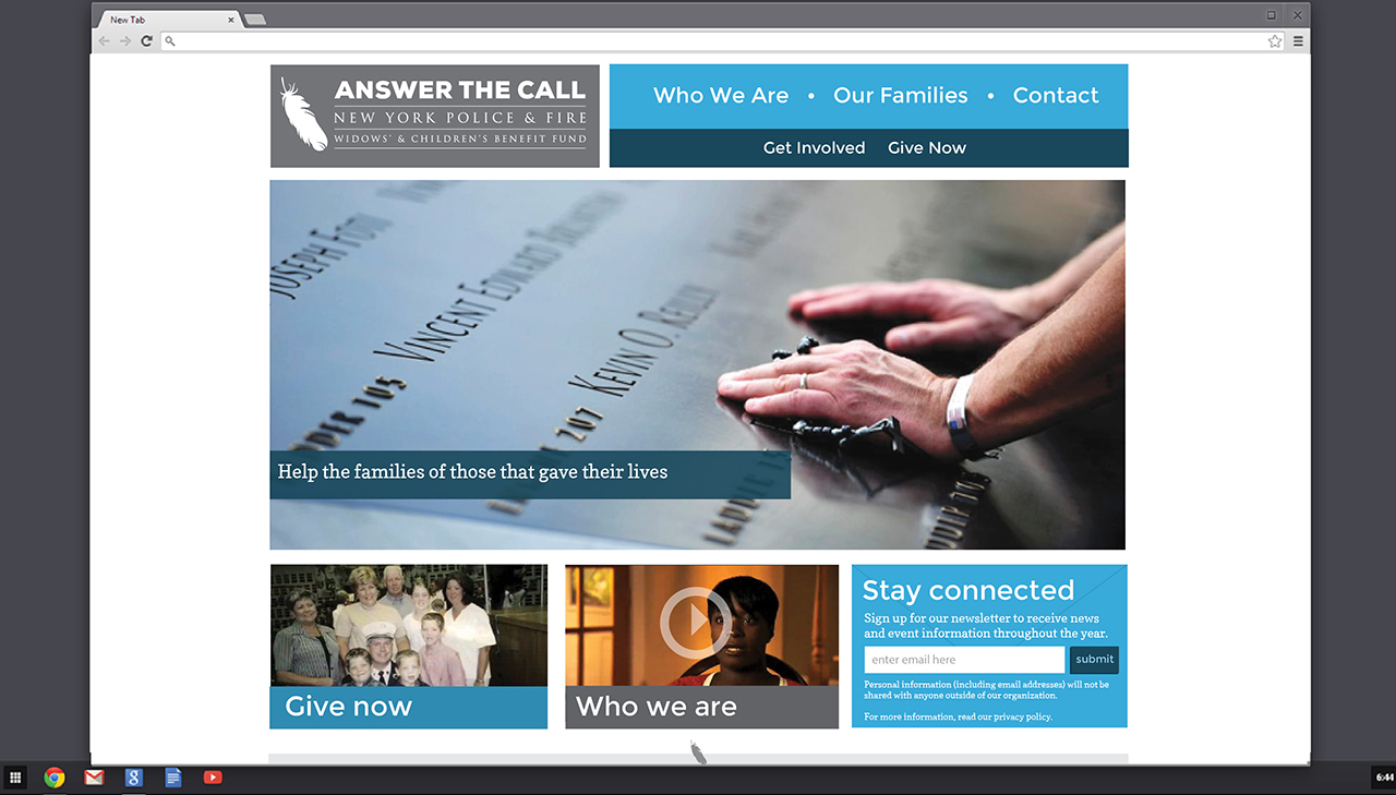
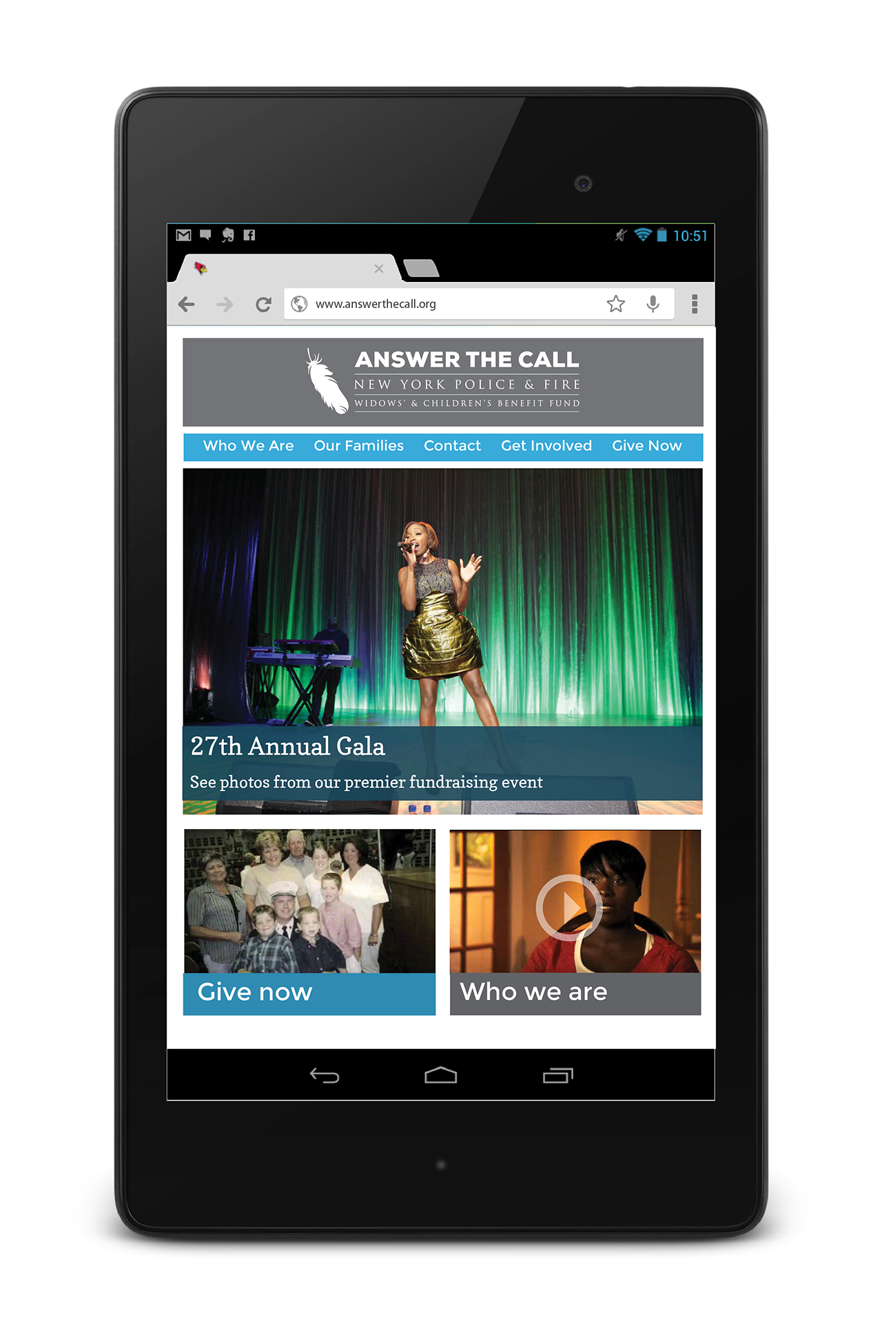
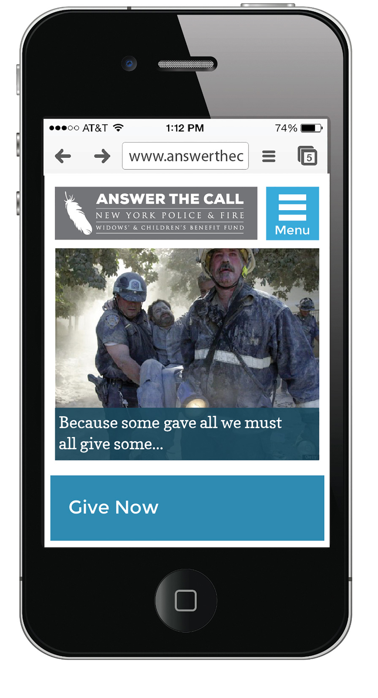
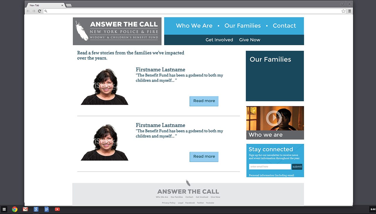
The new color palette was based on colors of gray pavement, and blue sheen of steel and glass skyscrapers. The dark blue also references the iconic uniforms of police, fire, and transit authority of New York City. Balancing these on a field of white gives life and hope to the colors, while the monochromatic system represents their earnest and serious focus on their goal. Typography did the same, modernized with strong, bold sans-serif, and a friendly accessible slab serif. A logo redesign was also commissioned, but a board decision lead to keeping the current logo to retain recognizability.
The Work

The Results
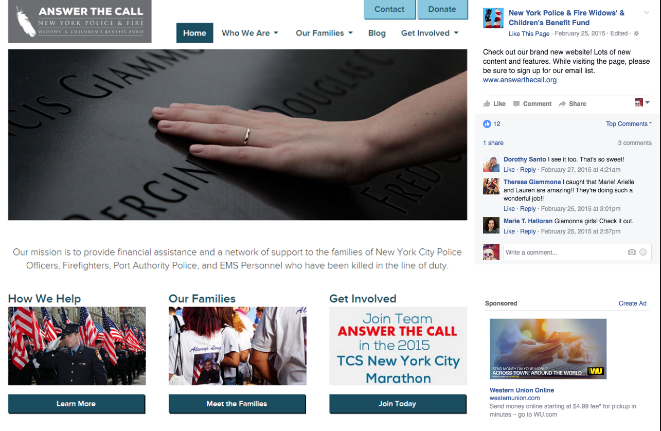
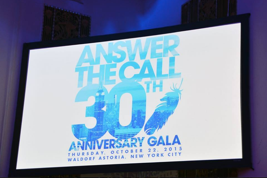
The launch of the website was met with positive reactions from the board, staff, and most importantly, their audience. The refresh was seen as a necessary and respectful growth of the organization, and visually pivoted Answer the Call to look towards a hopeful, uplifting charity organization. The color palette has been widely implemented beyond the website, from their annual Gala to press conferences.