Illinois State Housing & Dining
The Problem
The Housing and Dining websites at Illinois State University are seen as twin entities. For prospective students and their parents, they are the third most important aspect about a given college (right behind degrees offered and cost). They should also seek to provide a honest but positive preview into the daily quality of life of a typical student. In some cases, it could be the deciding factor as to whether a student chooses to attend your university over another. For a university servicing 15,000 on-campus students daily, individualized attention was a marketable advantage.
The Project
The Housing and Dining website had duel purposes: present a competitive, modern vision of student life at Illinois State; and provide quality timely information for both prospective and current students. Taking an iterative approach to design and planning with the clients, we were able to develop effective and unique layouts to reach the right audience at the right time.
Responsibilities
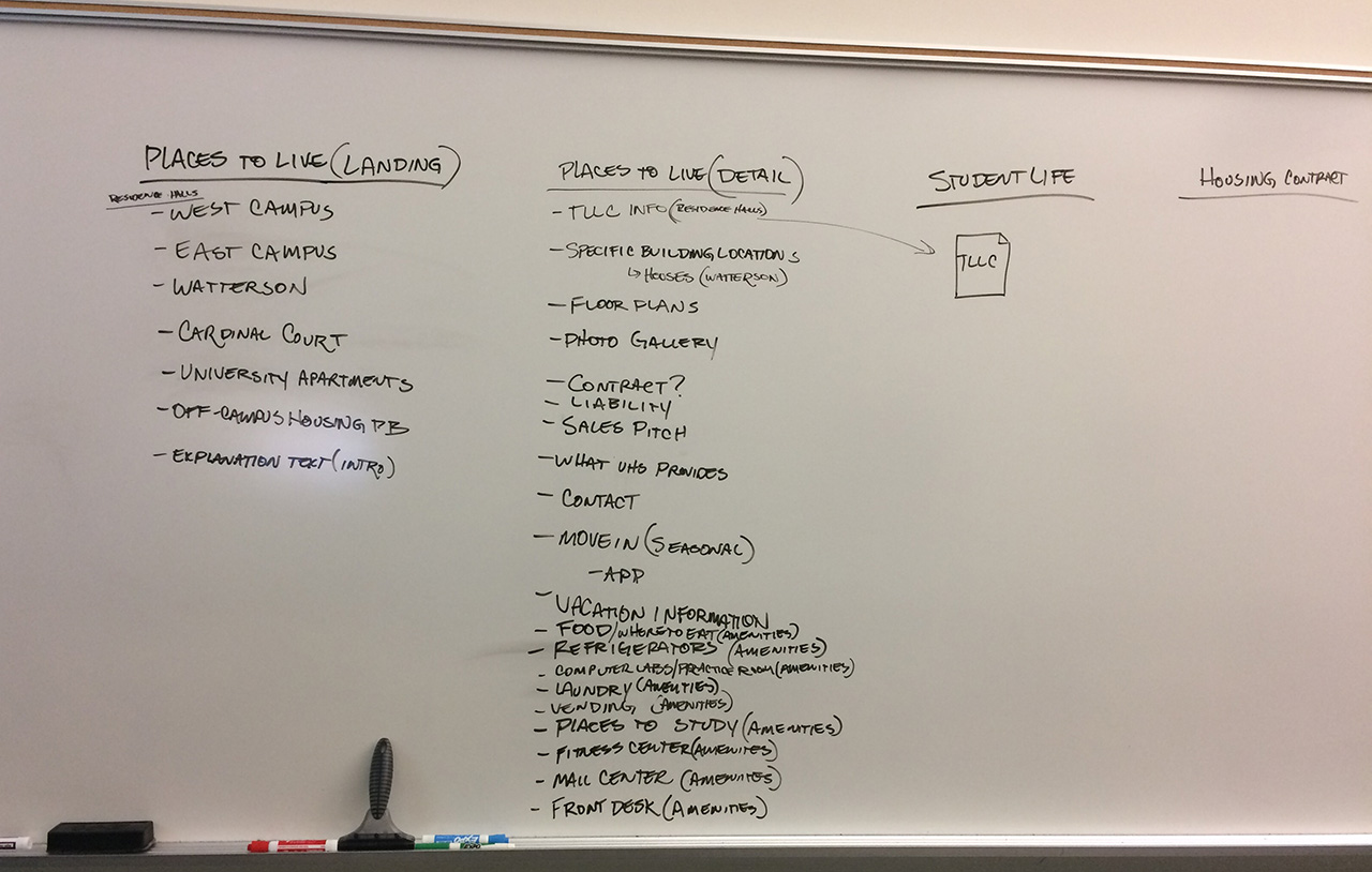
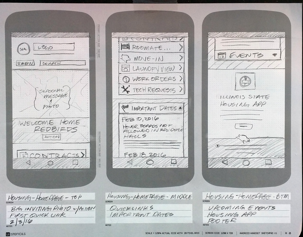
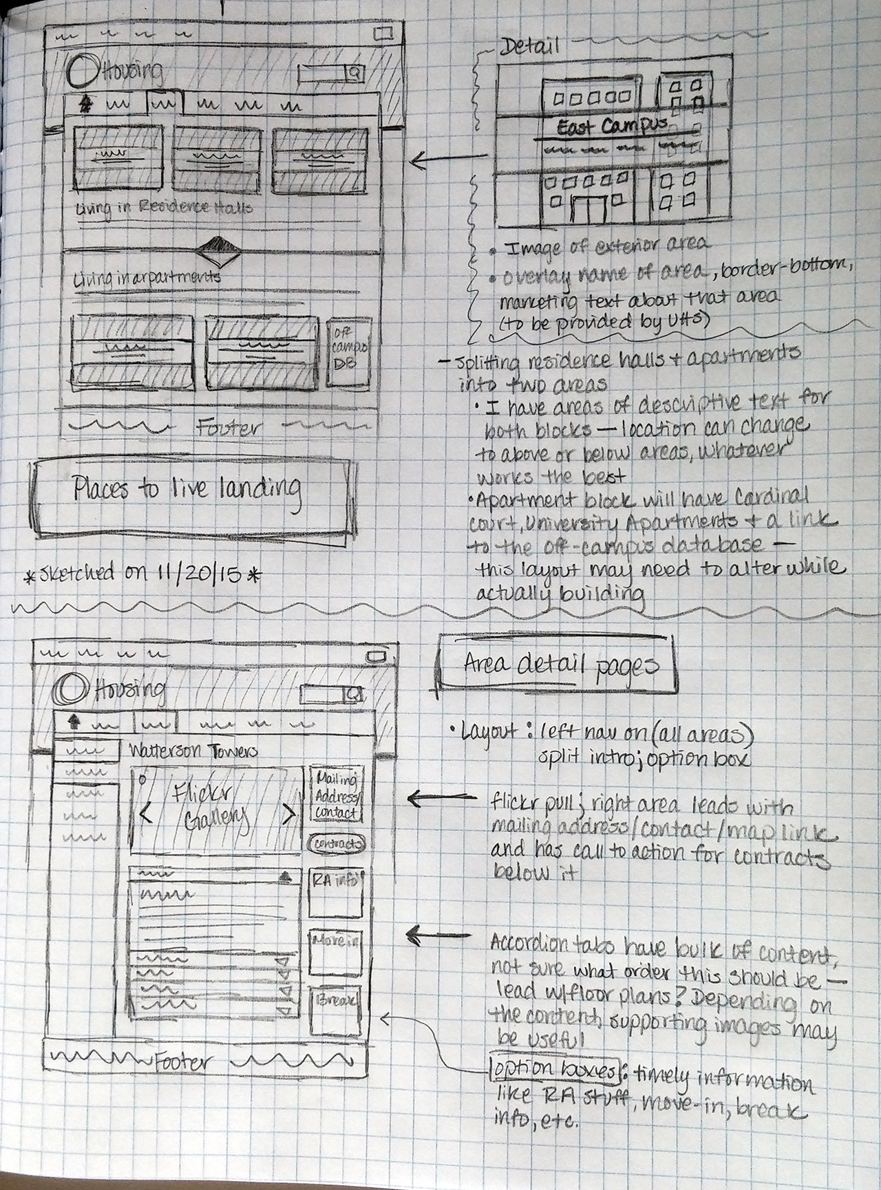
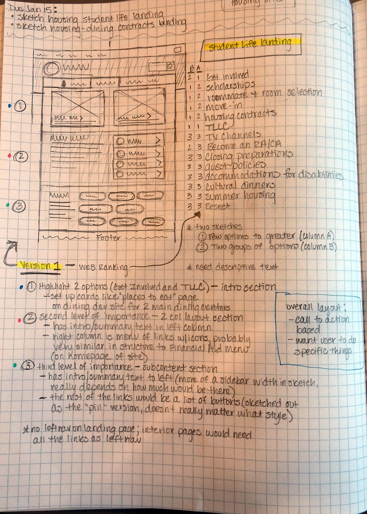
- Lead team of designers through each stage of research, ux sketching, prototyping, and interface building.
- Matched client goals to user needs, and created innovative design solutions.
- Planned and executed photo shoots of dormitories and dining centers.
- Kept collaborative lines of communication open between architecture, design, development and clients.
The Solution
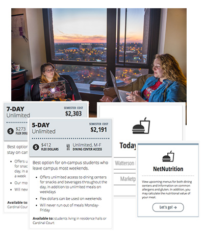
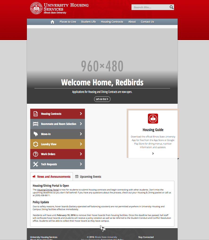
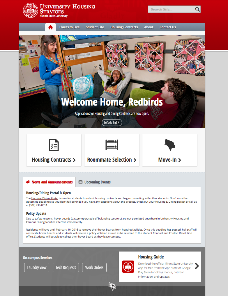
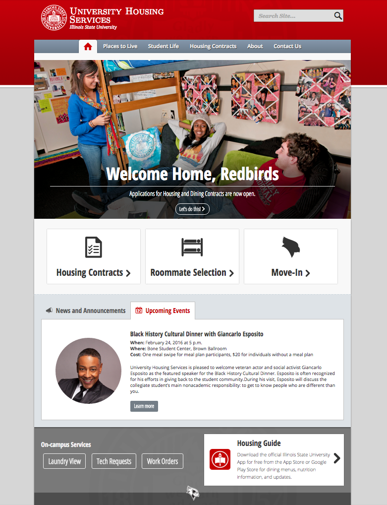
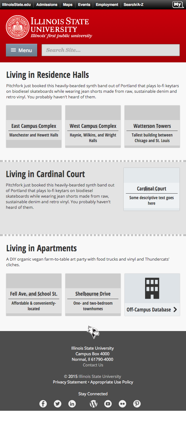
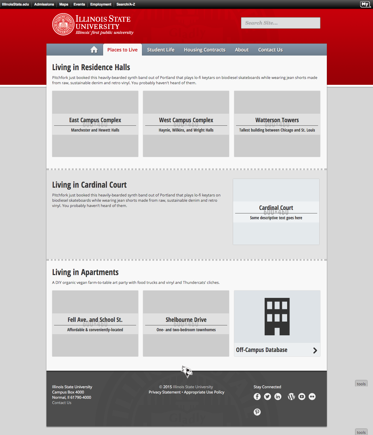
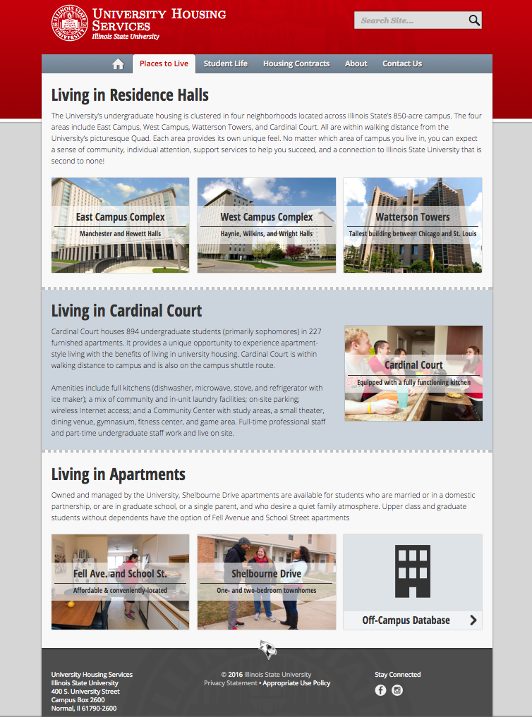
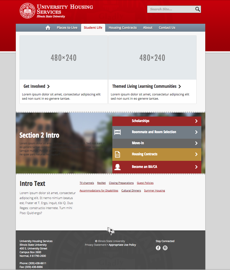
The website utilized a mixture of photography, iconography, and typography to create a visually diverse but balance layout for all audiences. Photographs provided a trust-worthy and candid view into student life in the residence halls and dining centers, while iconography and hierarchical typography organized dense contractual information needed each year. All this was housed in responsive mobile and desktop friendly website templates.
The Work


The Results
Employing an iterative process with clients, we were able to get fast results and react almost instantaneously to feedback. The final site was full of honest imagery, relatable content, and timely information in a easily updated environment for staff. Comparing the previous year’s traffic for the same month, visitor bounce rate reduced by nearly 30%, while sessions increased and pages/session also decreased. This leads us to believe we were able to increase the departments’ visibility, while also allowing users to find the information they need through less clicks.